Paired T-Test with Python

Paired T-Tests ✌️ #
Paired T-Tests are used to compare the mean of two measurements taken from the same individual, object, or related units. These paired or dependent measurements can relate to things like:
- Measurements taken at two different points in time (e.g. pre and post a change).
- Measurements taken under two different conditions (e.g. completing something under a control or experiment).
Test Requirements #
The paired T-Test can only compare the mean for two related pairs on a continuous variable that is normally distributed. You will need to ensure the following conditions:
- The dependent variable is continuous.
- The subjects in each sample or group are the same.
- The data is a random sample from the population.
- The data is normally distributed.
- The data do not have outliers.
Real Life Case Example 🚰 #
If you recall, in Flint, Michigan the water was found to be contaminated with lead in certain areas/homes.
The sequential water data analysis that was completed by the EPA was based on the paired T-Test. If you’re curious, click here to see the EPA’s results/slides.
How to Run a Paired T-Test in Python #
Now let’s take a look at how you can run your own T-Test in Python using the pandas and scipy.stats packages. I also share how to box plot your data using the plotly.express package.
# Import Relevant Libraries
import pandas as pd
from scipy.stats import ttest_rel
import plotly.express as px

# Create Test Sample Data (Example)
data = pd.DataFrame()
data['Sample'] = [1, 2, 3, 4, 5, 6, 7, 8, 9, 10]

data['First Draw'] =
[.344,2.133,1.111,4.007,1.951,3.2,4.0,1.1,4.6,2.2]

data['Second Draw'] =
[.226,3.77,.11,3.446,2.48,1.4,4,2.26,2.5,1.038]

# Show DataFrame
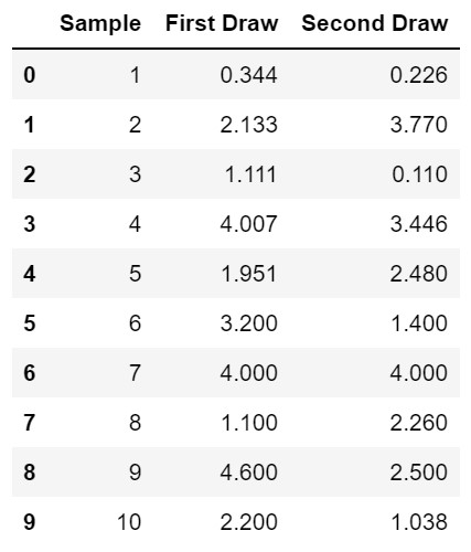
data
The data DataFrame will look like:

Now you’re going to run the paired test - it’s one line!
# Run Paired T-Test using ttest_rel
ttest_rel(data['First Draw'], data['Second Draw'])
Your output will be:
Ttest_relResult(statistic=0.883015457622429, pvalue=0.40019892411202596)
Analyzing the Output #
The test statistic is equal to 0.883 and the two sided p-value is 0.400. We’re using the two sided p-value as we’re interested to see if there is a negative or positive difference.
The paired T-Test follows the following null and alternative test hypotheses:
- H0: The means of the first and second samples are equal.
- HA: The means of the first and second samples are not equal.
Since the p-value is equal to 0.400, which is greater than 0.05, we cannot reject the null hypothesis. Therefore we do not have enough proof to claim that the true means of the sample collections are different.
Next, we can use the pandas melt() function to restructure the data so we can create a box plot with it. The function puts our two columns of data, “First Draw” and “Second Draw” into a new column called variable and then each value in those columns, into a new column called value.
# Use Pandas Melt Method to Reorient Data
data_melt = pd.melt(data, id_vars=['Sample'], value_vars=['First Draw', 'Second Draw'])
The data_melt DataFrame will look like:

I like to use the plotly express box plot to analyze and review the data further. If you missed an outlier or forgot to remove outliers, this final step helps.
# Use Plotly to Produce Boxplot of Melted Sample Data
fig = px.box(data_melt, x='variable', y="value", points="all")
fig.show()

This example has a small sample, so the points=“all” parameter makes it easy to see where all the observed data points fall in value.